Debates abound on what goes “above the fold” on a website.
The first question: where is the fold?
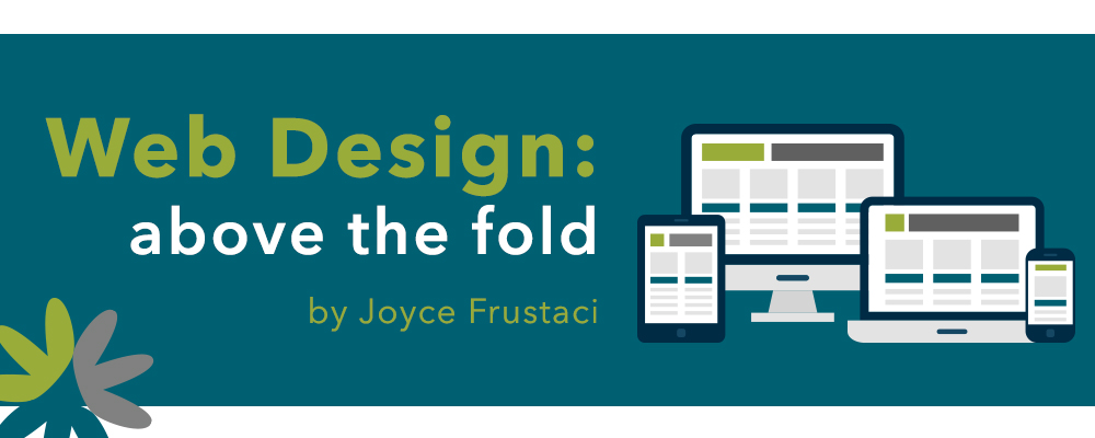
Ahh … the fold moves based on the device you are viewing the site, and if you’re on a desktop or laptop, how large you have your browser screen. So it’s obviously a moving target!
But, what is visible at the top of your home page has to be worthy enough to encourage your site visitors to scroll. Your goal in that top portion of your site is to connect with them and pique their interest. If you do that, they will scroll.
Let’s give your site visitors a good reason to scroll.
The top of your home page has to provide a story with impact. Remember you are “talking” to two types of people: those who respond to images and those who respond to the written word. If you use an image with impact in your top area with a text overlay, you begin telling that story. Depending on the services/products you offer, you may need one image (aka a hero image) or multiple images (aka sliders). It goes back to what you need to communicate to your visitors.
With a well-thought-out hero image or sliders, you begin to captivate them so they know you understand their situation and can help them. That’s why they’ll scroll.
Your Site Visitors
Think of the types of people who visit your site … that also helps you determine what to say.
- People who were referred to you may be visiting your site to gauge your credibility.
- Those who have heard of you (through a marketing piece) and want to learn more about you.
- People who found you from an online search.
No matter the visitor, that top portion of your site is key – so connect with them through your visual and copy message. Then give them the additional info they need to understand more about who you are and what you do. At Juice, we often do that through stunning text (a simple message below the top visual/message) and column graphics (targeting your main products/services).
Mobile Phones Taught Us to Scroll
With the high use of mobile phone viewing, people have become accustomed to scrolling. This translates into the desktop world as well. As a result, an overwhelming amount of content does not need to appear “above the fold.” Instead, use this area to connect with your site visitors – this encourages them to scroll, take in the rest of the information you want them to see/read on your home page, and continue learning through the other pages of your site.
Planning out the layout of your home page is a critical step when building websites. Taking the time to determine the correct messaging in all the areas of your home page gives you the ability to connect with your potential clients/customers/patients.
If determining the layout, visuals and messaging for your home page is overwhelming, no worries. We do that and would love to help you!