My eye for design is always on, even if I’m on vacation. Knowing that, I decided to snap some photos of a handful of designs that caught my eye on my trip abroad. By sharing them with you, I hope to provide insight into what connects, in sometimes subtle ways, to their intended audience.
No More Plain Planes
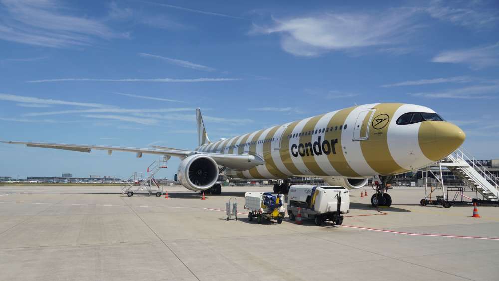
We had a connecting flight in Frankfurt, Germany. As our arriving plane moved toward our gate, this Condor plane design jumped out at me. The fact that they decided to break the norm of what is done with plane art thrilled me. Even more so when I learned that they have a series that uses the stripe design in various colors. If you’d like to learn more, here’s an article that talks about this decision they made.
Sweet Designs for Sugar
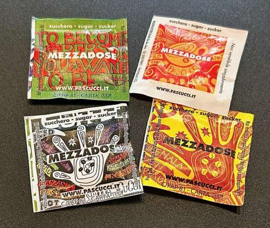
Having breakfast in a restaurant near the Vatican, I thoroughly enjoyed coming across these colorful sugar packets. Their vibrant designs are fun, but the “mezza” which means “half” is a wise move. The packet contains half the amount of sugar, or rather, half the standard “dose” as compared to a traditional sugar packet. It’s a helpful way to cut back on your sugar while still giving you a bit of sweetener.
Water with Flowing Art
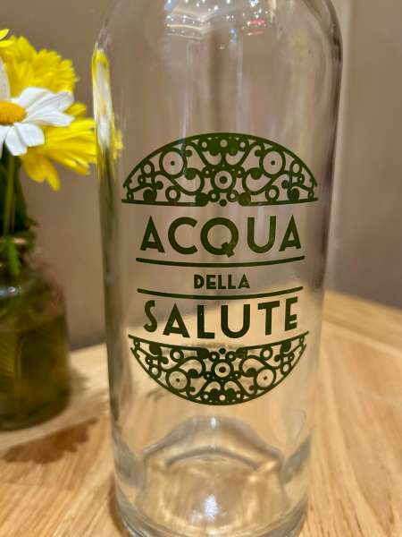
What catches me first is the scrollwork and how the lines balance the curves. The design made me interested in learning what the bottle’s words mean. Acqua della Salute translates to Water of Health. In delving into this further, these are Italian mineral waters with wellness and digestive properties. Interesting, no?
Elegant Elephant Logo Design
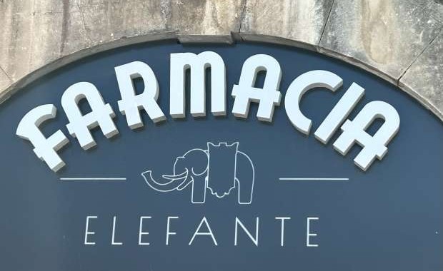
A pharmacy is a pharmacy. But a pharmacy with an elephant in its logo is definitely more interesting. The design is clean and simple, so the seriousness of the store is maintained. Do you wonder why they chose an elephant? It’s because the pharmacy is located at Piazza del Duomo which has the Elephant Fountain monument in the center of the square.
Fresh Fades, Clean Cuts
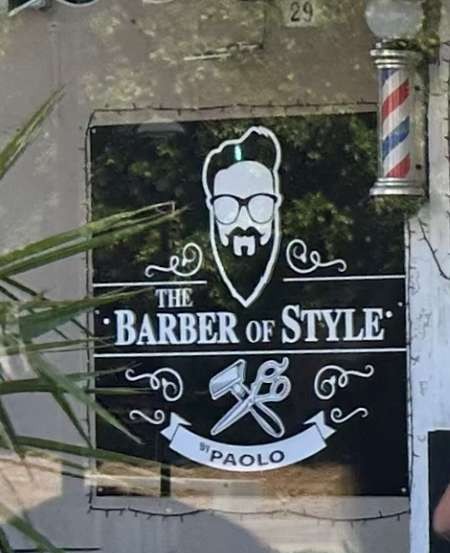
It can be challenging to have a one-color logo stand out, especially on a road filled with storefronts. This one did that for me. Although there are elements I’d do differently, overall, it caught my attention. Did it catch my eye more because our graphic designer is soon to be married to a barber? Hmm, maybe!
A Couple More Designs Abroad
There were others too. Yogorino uses a swirl effect for the “g” in their name. It’s challenging as a designer to capture a letter that also is something beyond the letter, but they did it masterfully.
Last but not least, I had to give props to a place that has a word that we use in our name too. That would be Juice Dudes in Barcelona. They found a way to connect the two words in their name — check out how the J and D play together. And I like the use of that masculine font. I feel it gives their logo character.
Hope you enjoyed this journey to Italy and Spain through the eyes of design!