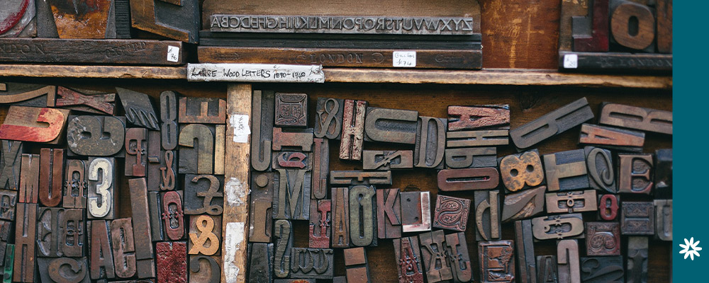
Fonts are one of the most crucial elements in design and branding. A font is a graphical representation of text and a medium of communication that catches the viewer’s eye and relays necessary information.
Fonts set the tone and personality of a design, often influencing viewers’ feelings toward and interactions with the design. Just like it would be considered inappropriate to show up to an interview wearing sweats and a T-shirt, similarly font styles have an element of appropriateness. Proper font choices are essential to the overall message and design of a piece.
What types of fonts are there?
Well—there are many! But the four main font contenders are:
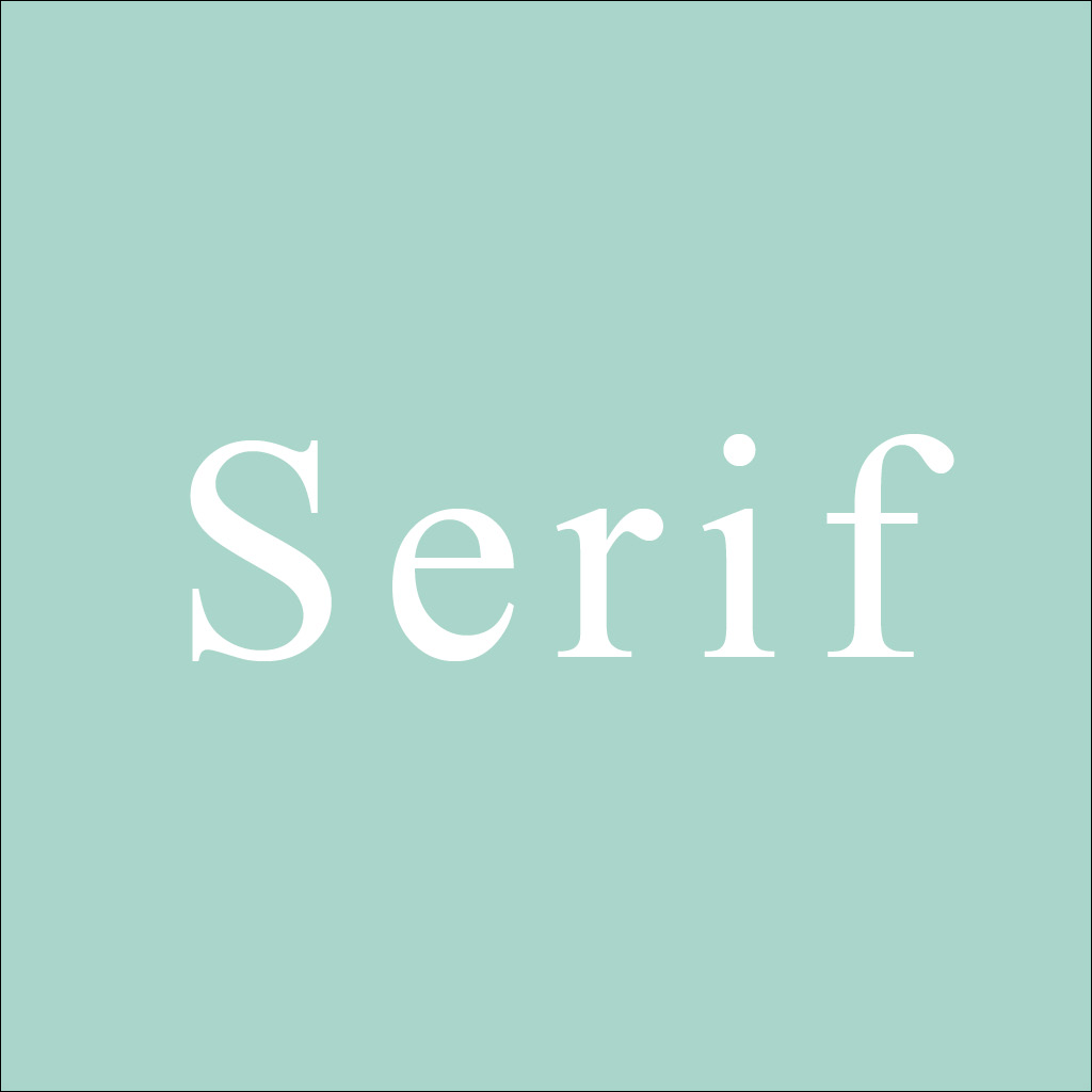
Serif: Serifs are the small strokes (or “feet”) at the end of a letter. Serif fonts refer to any style of type that has serifs. Times New Roman (a typeface so very familiar to students and academic papers) is an example of a serif font.
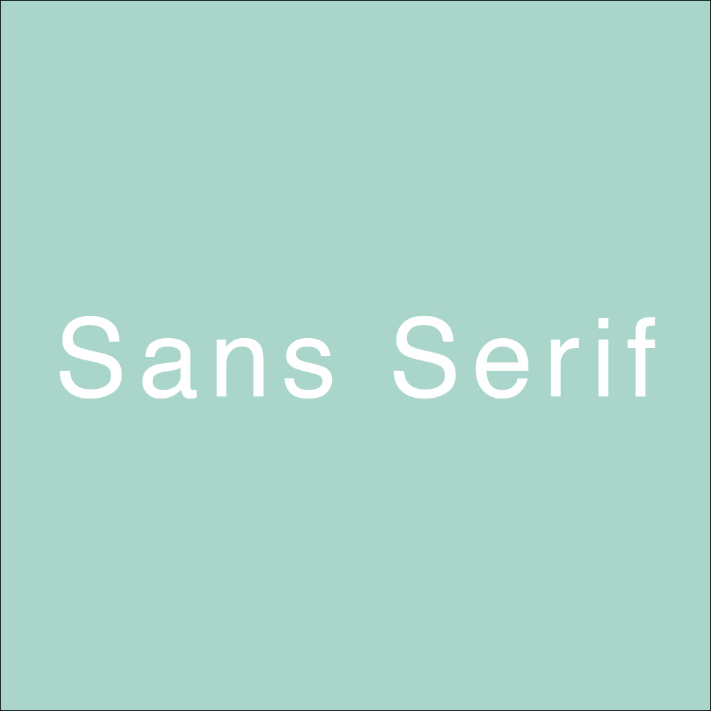
Sans-serif: As the name implies, “sans-serif” literally means “without serif.” These type of fonts do not have the extra strokes at the end of a letter. Helvetica is an extremely common example of a sans-serif font.
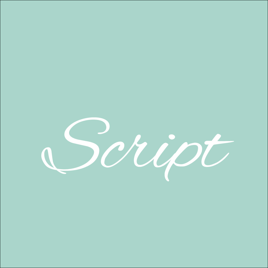
Script: Script fonts are typefaces with a personal touch, like cursive and calligraphic-styled fonts. These fonts generally have connecting letters

Display: Display fonts are decorative fonts that are meant to grab your attention. These fonts are typically used at large sizes for headings (such as movie posters) and have more eccentric and variable designs than a typical typeface.
What’s the best font choice for my design?
This is a tricky question, and it all depends on the overall look and message that you are trying to convey. Different fonts have different characteristics and qualities. For instance, serif fonts are generally thought of as more traditional, scholarly, and serious. Because serifs tend to make it easier for eyes to travel over text (their little “feet” acting as guides), serifs are useful for large blocks of text via print material.
Sans-serif fonts, on the other hand, may be considered more contemporary, sleek, streamlined, and trendy. Sans-serif fonts have better readability on screens, which makes them a good pick for web-based designs.
Script fonts are known for their elegance, artsy aesthetic, and romantic appeal—which is why they are so common on wedding invites and special events. However, this font is not meant to be used as body copy, as it’s not easily readable.
Similarly, display fonts are not meant to be used in large quantities. They are designed to intentionally grab a viewer’s attention, and this type of font often has the most personality of all. These fonts often incorporate elaborate decorations or textures to emphasize a certain focal point.
So what kind of message or mood do you want to convey with your designs? Serious? Casual? Quirky? Elegant? If the characteristics your font is communicating don’t match the message of your design, then there will be a visual disconnect between the viewer and design.
Determine what your message is, and find a font that complements it!